It’s hard to create clear, compelling presentations for proposals, capture, sales, marketing, or education. We know what bad presentations look like and have sat through many uninspired PowerPoint decks. However, when it comes time to design our own, we fall prey to the same traps and deliver bad presentations, too.
But what can we do to ensure that our presentations are good?
Apply these six tips and never create an unsuccessful presentation again.
Tip 1:
NEVER open PowerPoint when starting a presentation. Instead, define your goal(s) first and then write your takeaway. Your takeaway must give your audience a reason to care. I recommend focusing on the benefit(s) your audience will get after they apply the information you shared in your presentation. For example, “Make your job easier with these three new tools.” The rest of your presentation must explain and support the takeaway.
Tip 2:
Contrast is king. The human brain pays more attention to things that are different. For this reason, avoid overused slide templates, images, bulleted text, and so on.
Tip 3:
Ditch slide titles when possible. Missing titles force your audience to focus on the presenter to understand the point. It encourages cognitive curiosity, which improves understanding, recollection, and adoption.
If you must use a title, make sure your title gives your audience a reason to care about the content on your slide. For example, when I am making business proposals, I rename a title from “Our Organizational Structure” to “Faster Problem Resolution (with Our Organizational Structure).”
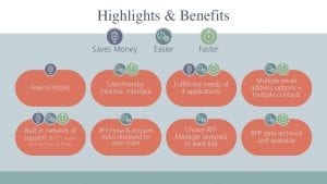
Tip 4:
Instantly make your slides look as if they were professionally designed by placing your bulleted text inside objects. For example, draw circles (or any shapes) and insert your individual bulleted text into each shape. The following are two examples I created for my clients:

TIP 5:
Slides are a visual medium so use professional designs and graphics. I have learned from experience and from the Association of Proposal Management Professionals (APMP) that visuals can make the difference between winning and losing in the world of business development. The aesthetic quality of your slides is indicative of the quality of your content and impacts win rates. Look at visualization solutions found at TheNounProject.com or Build-a-Graphic.com to help you make quickly professional graphics in PowerPoint. Newer versions of PowerPoint and other Office apps also include a free library of icons an symbols to get you started.
TIP 6:
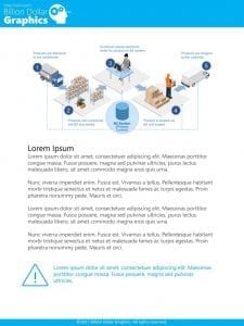
Move bullets and lengthy text from your slides and into the PowerPoint Notes section. Next, format this content as if it were in a Word document. For example, add a header, footer and icons to this page. Then format this Notes page to make it easy to read by using consistent font styles and colors. You can also add additional graphic elements to this section.
Present your slides with minimal text and supply these Notes pages in any format you like (e.g., printed or as a PDF) to your audience.
The following is an example of a formatted Notes page. The main image at the top of the document is from the slide, and the text below is in the Notes field.
Use these six tips to design PowerPoint presentations that make a difference and improve your success rate. If you want more tips and techniques, check out my newest book, A Trainer’s Guide to PowerPoint: Best Practices for Master Presenters (http://billiondollargraphics.com/powerpoint_book). This book details best practices for making and giving PowerPoint business development and proposal presentations.


Leave A Comment