
In the world of proposal design, many gurus tell you to follow the “rules.” But, like Captain Barbossa of the Pirates of the Caribbean franchise, I believe rules are more like guidelines. They are there for a reason but, if followed blindly, can lead to dire consequences.
Here are three common myths surrounding these “rules” and solutions to navigate around them.
MYTH 1: Avoid text.
Text is critical. Without text, your information is lost to ambiguity. Instead, avoid too much text. Take the time to find the most efficient way to communicate your message. Benjamin Franklin said, “I have already made this paper too long, for which I must crave pardon, not having now time to make it shorter.”
It isn’t easy to make complex content succinct and easy to understand. But it’s our job. Our goal is to communicate our message in the most efficient way possible, which includes both graphics and text.
MYTH 2: You have to be designer to make winning graphics.
A trained, experienced graphic designer will create visuals better than someone who has not honed that skillset. The challenge is finding the time or money to hire a designer.
If you don’t have the resources for a designer, do you avoid graphics? No, because you can use tools like the following three tools:
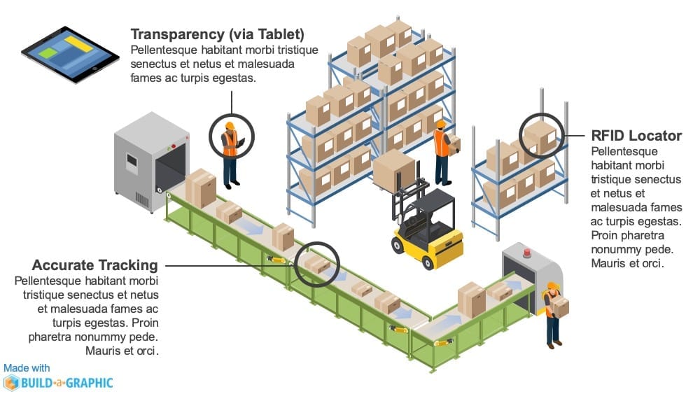
- Build-a-Graphic (Build-a-Graphic.com): Turn text into professional proposal graphics in PowerPoint. The following was made with Build-a-Graphic in about 10 minutes.
- Pexels (pexels.com): Find free photos and videos.
- Pixabay (pixabay.com): Find free photos, vectors and videos.
Good design isn’t about pretty pictures. Images should enhance and communicate your message clearly. If you’re not a designer, then learn and employ a process to turn text and ideas into winning visual concepts. One process is detailed in DIY Billion Dollar Graphics (http://billiondollargraphics.com/ebook). Another helpful book is Back of the Napkin (https://www.amazon.com/Back-Napkin-Expanded-Problems-Pictures/dp/1591842697).
MYTH 3: Infographics need to look like this…
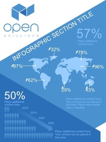
The paradigm for infographics is to combine quantitative facts and icons with explanatory text. This is too limiting (and is often done poorly). Instead, use all types of visual solutions. Pick the approach the tells your story at a glance. There are many different infographic styles that can convey your message. The following are other types of infographics to consider:
- Bridge graphics
- Gears graphics
- Timelines
- Stacked graphics
- Spiral graphics
- Funnel (or Filter) graphics
- Road graphics
- Pyramid graphics
- Cutaway diagrams
- And many, many more options
The next time someone shares a rule, stop and decide whether it applies to your situation—and consider it more of a “guideline.” Find the best path forward for your proposal and increase your odds of success.


Leave A Comment