“Everybody hates PowerPoint,” writes Geoffrey James in his January 21, 2020, Inc. magazine article: “It’s 2020. Why Are You Still Using PowerPoint?” Although his article is well written and researched, James is engaging in a “clickbait” technique exploiting a provocative opinion and using a provocative title to garner readers. He doesn’t consider the alternative (albeit less clickable) view—PowerPoint isn’t the problem (mostly), but how people use it is the problem.
Many PowerPoint presenters and designers are using this powerful software in the wrong way.
Here are a few points I hope future authors will consider when engaging participants through PowerPoint (e.g., oral proposals, training, debriefs):
#1) Yes, PowerPoint is often used poorly and hinders understanding—so change how you use the tool.
James asserted that, “Everybody hates PowerPoint.” This exaggeration makes a point that most audiences are not a fan of bad PowerPoint. Yet, many of us are guilty of making these same bad presentations that we complain about.
PowerPoint users tend to approach slide design as if developing a Word document. The end result is a dense, verbose, text-heavy set of slides that would be more effective as a handout.
The solution is to think of PowerPoint as an engagement tool and not a handout or speaker notes. Presentation software, when used properly, pulls your audience in. It makes them curious and eager to learn more. If you put all of your content on the slide, the opposite happens. Your audience starts reading and ignores you or they completely tune out due to information overload.[intense_blockquote width=”33%” rightalign=”1″]If someone made a bad presentation because they didn’t know the best way to do it, why blame PowerPoint? [/intense_blockquote]
The focus should be on the presenter and not the slides. The slides are nuggets of information that support what the speaker is saying. If you need handouts, do not share your PowerPoint slides. A properly constructed PowerPoint slide is not optimized for handouts. Instead, share a Word-based handout or a formatted version of PowerPoint’s Notes Pages.
In a follow up article (https://www.inc.com/geoffrey-james/powerpoint-has-its-defenders-but-theyre-wrong.html), James states the following:
“The problem isn’t whether the tool is easy to use (although PowerPoint is the typical Microsoft pig’s breakfast) but that the entire premise of presentation software–that words and images on the screen reinforce words being spoken–is fundamentally flawed.”
When a PowerPoint presentation is crafted poorly, the slide content does not reinforce the spoken words; however, when done correctly, a deeper understanding is the outcome. For example, what if you were explaining what a circle is. Your oral explanation may be, “A circle is a curved line with every point equidistant to the center.” An appropriate corresponding slide may show a circle. The speaker can then reference the image to further clarify the definition with a pointer or follow up slide.

Both simple and complex explanations benefit from visual as well as oral and written communication. Based on my decades-long experience developing and delivering presentations, this approach yields more favorable results than traditional, text-heavy slides.
In the world of bids and proposals, there will be times that an oral proposal is essentially a written proposal delivered in PowerPoint. In which case, do what you need to do to comply with the requirements. Be judicious with the amount of text needed to explain your solution and use animated builds (reveals), when possible, to avoid information overload.
#2) Stand out. Use PowerPoint to make people curious.
As James’s article points out, our brains do not like to process multiple versions of the same message, which often confuses an audience. Instead, use PowerPoint to create cognitive curiosity. Plant the seeds for an essential point you will make later in the presentation. Give people a reason to care and want to learn more. Connect your content to something that motivates your audience. For example, present a problem then say there are three ways to solve it. Your slide may look like the following.

Use this approach as your agenda and reveal each solution as you move forward to keep the audience engaged.
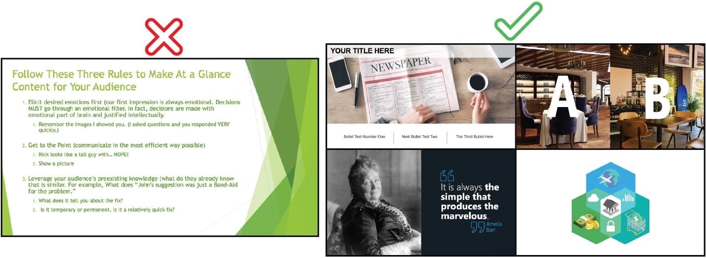
Do or show things that are not expected (and are relevant). Most of us expect to see the left slide example shown below, which makes our brain react with “Here we go again. This is why I hate PowerPoint.” When we see slides that look like the examples on the right, we quickly assume that the associated content will be unique. Our brains will want to pay closer attention, wondering where the presenter is going next.

Use stories to contextualize and reinforce a point you are making. Weaving a story into your presentation is an emotional way to engage an audience. Your presentation tells a story whether you want it to or not. The question is, did you tell a good or bad story?
#3) A PowerPoint presentation is a dialogue and not a monologue.
In the same article, James writes that PowerPoint “constricts discussion.” When done poorly, a presentation designed in PowerPoint can hinder conversation. The best practice is to see your audience as participants in the presentation. Architect your content so it invites participation—even if it’s rhetorical and does not require an observable response. Invite and celebrate when an audience member wants to share their insight or ask a question during your presentation. It means that they are engaged!
PowerPoint is not (usually) meant to play like a television show to inform or entertain your audience with no input. PowerPoint is a tool used to improve understanding, recollection, and adoption and that requires engagement. An open dialogue with all participants is a fantastic way to pull people in and help them remember your content.
#4) PowerPoint is a tool. It’s only as good as the user and the user is only as good as their understanding of presentation best practices.
Yes, PowerPoint could be more intuitive or start people with less text-heavy slide options. The software is getting better. Nonetheless, if someone wrote a bad book, would you blame Microsoft Word? The same is true for presentations. If someone made a bad presentation because they didn’t know the best way to do it, why blame PowerPoint? As with any tool, you need to learn how best to use it to get optimal results. Take a PowerPoint class, read a book, watch good presentations. What have you seen that works? Do more of that.[intense_blockquote width=”33%” rightalign=”1″]Presentation software, when used properly, pulls your audience in. It makes them curious and eager to learn more. [/intense_blockquote]
In all forms of communication, there is no one-size-fits-all solution that always delivers ideal products for every situation and audience. The same is true for presentations. PowerPoint isn’t perfect, but it’s the industry standard for presenting. It helps the author and presenter decide what they want to say before they say it, which often results in a better presentation. The downside is when the slides are used as handouts or notes for the author rather than as the visual medium it was meant to be. Bullets are better than paragraphs, and visuals with minimal text are better than both. Use PowerPoint the right way and you and I will see fewer “Stop Using PowerPoint” clickbait articles and start seeing “Audiences Will Love Your PowerPoint Presentation If You Do This” articles.


